Lucidworks Launches Fusion on Google Cloud Marketplace
Lucidworks launches AI-powered search platform Fusion on Google Cloud Marketplace and joins Google Cloud Partner Advantage Program.

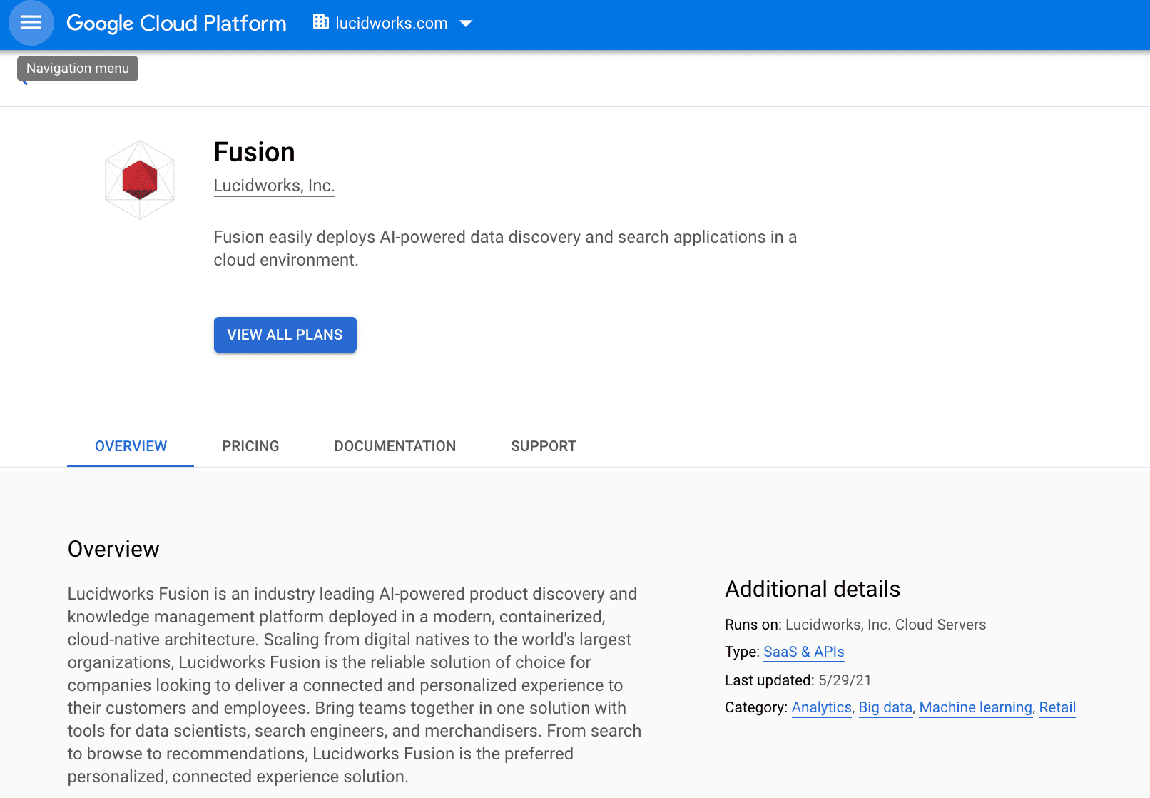
Lucidworks Fusion is now available on Google Cloud Marketplace. Customers can easily deploy Fusion to create product discovery and knowledge management applications that provide users with contextual, personally relevant search results and proactive recommendations powered by AI.
Lucidworks also joins the Google Cloud Partner Advantage Program. This partnership enables joint collaboration between Google and Lucidworks engineering teams to power seamless support and services. Our customers can focus on what they do best, and we can focus on delivering best-in-class solutions.
Fusion Takes Another Step Into the Cloud
By 2022, Gartner predicts that 75% of all databases will be deployed or migrated to a cloud platform. A portion of businesses that we assumed would stay on premises are now moving to the cloud, and this exciting partnership with Google Cloud is reflective of this larger market shift. Fusion can scale to deliver connected, personalized experiences for large legacy organizations all the way to digital natives who are early cloud-adopters.

With Fusion, customers can access four key capabilities:
- Increase control around browse and search experience to deliver the right results to users, remove friction, and increase revenue and efficiency.
- Deliver consistent and personalized experiences across the user lifecycle by personalizing results based on demographic information and historical behavior.
- Leverage existing knowledge across the organization to empower knowledge workers to do their best work by eliminating information silos and quickly providing necessary information to improve employee engagement and productivity.
- Maximize the value of data discovery and enable organizations to find connections, patterns, and anomalies in data sets in order to make informed decisions.
Google Cloud is the most trusted and secure cloud platform. It lets users quickly deploy software packages that run on Google Cloud, with no manual configuration required. That flexibility and ease-of-use is a key driver in the work Lucidworks does to develop ecommerce, enterprise, and customer service solutions.
Product Add-Ons Available on Google Cloud Marketplace
Lucidworks’ offering on Google Cloud includes applications that run on the Fusion platform, such as Predictive Merchandiser (PM) and Smart Answers. PM helps ecommerce teams harness the power of machine learning to boost conversions. Smart Answers enhances chatbots and virtual assistants with natural language processing and deep learning to reduce time-to-resolution and support costs.
If you are curious about how Lucidworks Fusion, Smart Answers or Predictive Merchandiser could improve your digital experience, check out the Fusion listing on Google Cloud Marketplace.
Contact us today to learn how Lucidworks can support your digital transformation efforts.
LEARN MORE
Contact us today to learn how Lucidworks can help your team create powerful search and discovery applications for your customers and employees.